


Go back
Reducing Design Inconsistencies, Enabling Faster Workflows
Just Visuals

Project Overview
At Rizzle, I led the revamp of the design system, one of the most impactful projects during my tenure. The existing system was plagued with inconsistencies, broken components, and scalability challenges, which hindered productivity and introduced visual inconsistencies across the product.
This case study shows my process of why the revamp was needed and how it was done.
Stakeholders
Category
Design & Improvement
My Role
Design system & Product Designer
Team
2 PD, 1 PM, 2 Engineer
Why Revamp?
When I joined Rizzle, I was excited to work on innovative AI-powered products. During my first few months, I was asked to explore the existing design system and the Text-to-Video (T2V) product, diving into the screens, user flows, components and working on improving small features.
As I started working on the product, I encountered design inconsistencies and implementation gaps almost daily. I often found myself discussing these issues with my teammates, asking questions like:

Illustration showing i am confused with questions
While I was asking these questions, I noticed other team members were also struggling and discussing these issues with each other. These interactions highlighted that I wasn’t alone in facing these challenges. The lack of clear guidelines and consistency created confusion and inefficiencies across the team.
Over time, I realized these issues weren’t just slowing down the design process—they were adding unnecessary complexity and making it harder to maintain a unified design language.
The Research Phase
Before diving into the revamp, I prioritized a small research to ensure we built a design system that was not only functional but also scalable and future-proof. At the same time my main focus should be also on making the system as per how the team needs it or the problems they are facing to solve in the revamp. So what I did was:
Collaborated with team to understand all pain points
Researched Existing Systems and Resources
Collaborating with the Team
I conducted informal interviews with my teammates to understand their pain points. For example, I asked them about challenges they faced when using the design system, their thoughts on the existing components, and any recurring issues during reviews.
No clear guidelines for using colors in text, backgrounds, or borders, leading to inconsistency.


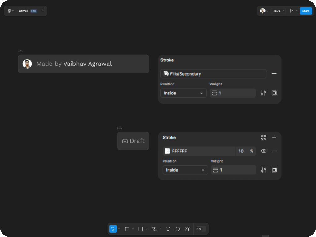
No centralized documentation/Guidelines for the design system, leaving designers and developers guessing.
Missing icons or inconsistent icon sizes disrupt design workflows and require manual fixes.

Existing components aren’t scalable, forcing us to detach and modify them manually.


Components and styles are poorly named, making them difficult to locate or reuse in Figma.
Frequent design discrepancies increase review cycles, slowing down delivery timelines.
These conversations highlighted practical and recurring challenges, such as confusion in color usage, difficulty swapping component content, inefficiencies in designing frequently used elements like snackbars and wizards, and the absence of a proper icon library. Additionally, the lack of clear guidelines and scalable components made it harder to maintain consistency across designs.
Understanding these pain points gave me a clear direction to address and resolve these issues through a systematic revamp of the design system.
Studying Leading Design Systems
To ensure I was building a design system that was not only functional for Rizzle but also scalable and future-proof, I dedicated significant time to studying other design systems from renowned companies. This research phase was crucial in defining the principles and practices that would guide my approach.
I analyzed 8-10 well-known design systems, such as GitHub Primer, Uber Base, Shopify Polaris, Atlassian Design, IBM Carbon, Untitled UI Kit, and many more. I focused on understanding their principles, structure, and approach to scalability.


Studying leading design systems taught me the importance of simplicity, scalability, and consistency in creating a robust framework. Clear naming conventions, flexible components, and proper documentation stood out as essential practices. However, two aspects stood out above all:
Usage of Design Tokens and Token naming techniques.
Scalable and modular components with variants
Design Tokens
IBM Carbon, Uber base and Atlassian Design showed me the power of design tokens. These tokens simplify design decisions by creating a standardized library for colors, typography, and spacing, making it easy to maintain consistency across products.
They also simplify decision-making for designers and developers by providing clarity, reducing cognitive load, and eliminating ambiguity. Designers can quickly pick the right token, while developers reference the same names in code, ensuring alignment.

Atlassian figma plugin
Tokens are especially powerful for scalability—they adapt to new contexts (like light/dark modes), maintain consistency across platforms, and enable rapid updates. By implementing tokens effectively, a design system becomes modular, efficient, and future-ready.

Uber token definations
Tokens, updates are centralized. A single change to a token propagates globally, saving time and maintaining uniformity.
With Figma variables further amplify this power, allowing dynamic token management and enabling teams to adapt seamlessly to evolving design needs.

Scalable and modular components with variants
The second key finding from studying leading design systems was the emphasis on modular and scalable components. When exploring these systems, I noticed a common thread: all components were meticulously structured with proper naming conventions and consistently applied auto layout. This level of precision ensured that the components were not only easy to use but also scalable over time.
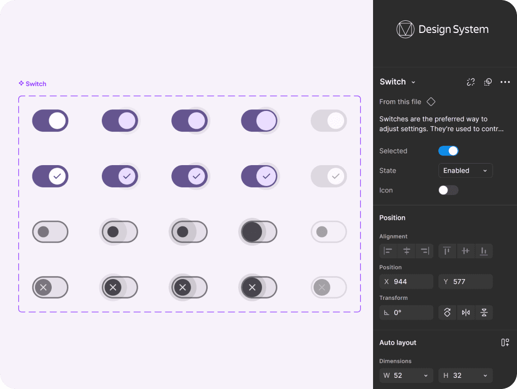
Material UI toggle UI component varriations
A significant observation was the extensive use of nested components. For instance, a checkbox component wasn’t a single flat element but was broken down into smaller, reusable child components—such as the box, checkmark icon, and label text. This modularity made the checkbox highly adaptable, allowing designers to quickly adjust or customize it for different use cases without starting from scratch.

Untitled UI nested component

The proper use of auto layout, combined with this modular and nested approach, directly contributed to the scalability and flexibility of these systems. By leveraging Figma's advanced features—like exposing nested properties—these design systems empowered teams to work more efficiently and maintain consistency across projects.
The Design systems exploration research gave me a clear understanding of how to approach the revamp and what steps could be taken to make the system both functional and easy to use.
Diving into Design System Best Practices
To deepen my knowledge, I explored articles and resources on creating scalable design systems, especially for fast-evolving tech products. Platforms like DesignSystems.com and Medium offered excellent insights into advanced design systems. Additionally, I delved into Figma-specific methodologies, such as design tokens and component swapping, to further streamline workflows.
Some of the key resources I referred to include:


These resources provided actionable insights that shaped my approach to revamping the design system.
Re-building the Design System
After identifying the pain points and gathering insights from research, I transitioned into the execution phase—laying the foundation for a scalable, cohesive, and user-friendly design system.
Initial Observations
Upon reviewing the web design system file, I discovered that many components lacked proper auto-layout implementation and foundational consistency. As the system had been in place for a long time, rebuilding everything from scratch was not feasible due to the extensive effort required from the team to replace components in all existing files.
To address this challenge, I collaborated with the team to create a comprehensive plan for the redesign. We:
Audited Components: I worked with the team to list all components and design system elements currently in use.
Categorized Effort: I categorized components into low effort (e.g., minor fixes or foundational updates) and high effort (e.g., completely broken components requiring reconstruction).
Prioritized Work: Using this categorization, I created a roadmap for addressing components in a logical order—starting with foundational fixes to ensure a strong base for the redesign.
Atomic Design Principles
To maintain consistency with the existing system, I followed the Atomic Design methodology, Starting with fixing foundational elements like spacing, colors, and typography to establish a solid base. Once the foundations were refined, I moved on to updating smaller components, which naturally improved larger, more complex components.
This systematic approach ensured scalability and consistency across the design system without disrupting existing workflows.

Atomic design concept illustration by Brad Frost
Simplifying Spacing & Radius
Spacing was one of the most misused elements in the existing design system, leading to inconsistencies in layouts and visual hierarchy. To address this, I prioritized setting clear and practical guidelines for spacing across the system.
After reviewing multiple approaches, including 2-pt,4-pt, 8-pt, 12-pt, and 24-pt systems, we determined that 2-pt and 8-pt spacing was the optimal choice.

Spacing definations
This decision was guided by the product's requirements:
Breathing Room: The interface needed enough space to feel open and easy to navigate.
Efficiency in Complex Screens: Given the complexity of Rizzle’s driven workflows, the spacing system also needed to accommodate dense layouts without feeling cluttered. This balance made the 2-pt and 8-pt system the perfect"sweet spot.

Token setup figma
I created a set of spacing tokens in Figma with a clearly defined scale (e.g., 2px, 4px, 8px, 12px, 16px, 24px…). These tokens were named and categorized for quick access and consistent application.
Defining the Perfect Border Radius
While revamping the design system, I identified inconsistencies in the use of border radii across components. To bring clarity and uniformity, I introduced a structured approach to defining radii.
During my research, I came across a formula that helps achieve a perfect radius match between two containers:

Keeping this formula in mind and aligning it with our design requirements, I documented this concept to guide the creation of elements. This approach allowed me to establish a scalable and visually harmonious system for border radii. With this foundation, I set up border radius tokens in Figma, ensuring consistent and seamless application across all components.

Spacing token setup figma
Both of the approach allowed us to quickly apply predefined Spacing and radius values, simplifying workflows and enhancing the overall visual cohesion of the design system.
Setting up the color tokens
The color system in the existing design was causing significant challenges. Many colors were exposed in Figma without clear categorization, leading to confusion about which color to use for specific elements—such as text, borders, and backgrounds. We often struggled to determine which color was appropriate for content, hierarchy, or interaction states. This resulted in inconsistencies across the design, and frequent mistakes when picking colors.
Based on the research, I knew exactly how to address this. The answer was tokens.
I decided to streamline and structure the color tokens for clarity and consistency. For this i started with
Creating Collections
I set up master collections with all the colors in the palette. From this, I created sub-collections to expose only the relevant colors for specific use cases, such as borders, backgrounds, or content.
This technique let me use the collection and hide all the unnecessary colors which are not required for product making it vert focused when select a color in token color picker hence reducing the problem of cognitive load to designers when picking or deciding colors for elements.

Illustration depicting the collection behavior in figma

Figma color token setup
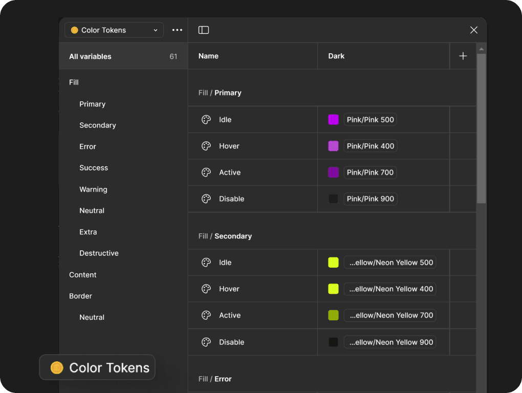
Figma color token setup
Introducing a Clear Naming Convention
To simplify the decision-making process, I used terminologies like:
Content Colors:
Content 87,Content 60,Content 30(indicating opacity levels for text)State Colors:
Primary Idle,Primary Hover,Primary Active, andPrimary Disabled.Semantic Colors: For feedback elements like success, error, or warning states. This made it easier for designers to quickly choose the right colors for different scenarios without overthinking or second-guessing.
Border Colors: Borders colors are defined based on intensity. Border 10 is the lightest where as border 100 was brightest.
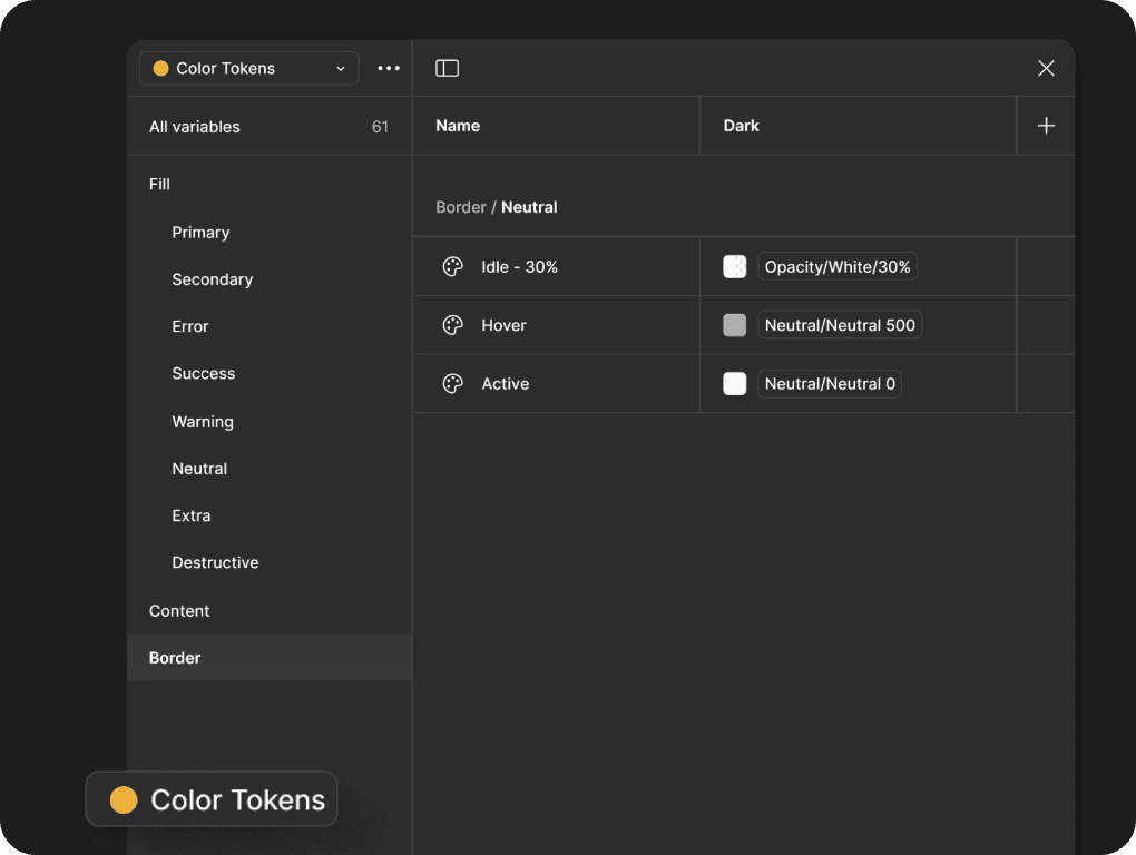
Border color token setup
Enabling specific Properties
Figma allows token properties to be restricted for certain uses, such as applying a token to text, borders, or fills. I enabled these restrictions to guide designers toward correct usage.

Border color token scope setup
This helped reduce the cognitive overload of tokens by displaying only the colors relevant to a specific element, enabling quicker decision-making during the design process.
Setting up Light and Dark tokens
Through market research, we recognized the growing need to introduce a light mode to align with user preferences and industry trends. To support this transition, I implemented a dual-token system to accommodate both dark and light modes seamlessly.
As this was a significant branding change, we began by applying it to the website as a first step, with plans to gradually roll it out to the product in the future. Thanks to the token setup using Figma Variables, achieving light mode is now as simple as flipping a toggle switch.

Figma color tokens
This tokenized approach drastically reduced cognitive overload for designers, as they no longer had to sift through unnecessary colors or guess which ones to use. Validators will also found it easier to ensure consistency during reviews, as colors were clearly defined for specific purposes. This shift immediately improved both the speed and accuracy of the design process.
Expanding Iconography
Iconography didn’t require extensive changes. We used the Feather Icons library for most cases but lacked icons in multiple sizes. I addressed this by setting up scalable sizes and adding a few custom icons for missing use cases.

Icon library
Crafting Components
With the foundational elements: spacing, colors, and iconography in place, the next step was building the components(Molecules and organisms). Components are the building blocks of any design system.
Based on the prioritization list i started working on them-
Buttons
Buttons were among the most frequently used elements in the product, yet their implementation lacked consistency. Re-designed buttons to cover all states—Idle, Hover, Active, and Disabled—with variations for primary, secondary, tertiary, and destructive actions. Leveraged the new color tokens for fills, borders, and text to ensure consistency across the system.

Button component breakdown

Button component variants setup
Input Fields
Input fields were another critical area that needed attention. Defined clear states for Focused, Error, Disabled, and Default, ensuring visual clarity at every stage. Enhanced readability with better line heights and contrast ratios, aligned with the updated typography system.

Input field component breakdown

Input field component variants setup
Wizards and modals
Wizards are key to guiding users through multi-step processes, especially in an AI-driven platform like Rizzle. While Wizards and modals were heavily used in the product, but their detached implementations caused inefficiencies.
Designed flexible wizard components with clearly defined step indicators, progress bars, and navigation controls. Leveraged Figma’s instance swap feature, allowing dynamic replacement of wizard content without detaching components. Ensured wizards adapted to different screen sizes and maintained consistency across devices.

Wizard component breakdown

Popup component breakdown
Sanackbar
Snackbars are integral to providing quick feedback or prompting actions within the product. Created predefined snackbars for success, error, warning, and info states. Enabled instance swapping for snackbar messages, making it easy to update content without detachment. Designed snackbars to work seamlessly on both desktop and mobile screens.

Snackbar component breakdown

Snackbar component variants

Snackbar child components
Tooltips
Tooltips are an essential microinteraction element, providing users with helpful tips or explanations without cluttering the UI.
Designed tooltips to dynamically adjust their size based on the length of the entered text, ensuring readability without breaking the UI. Made tooltips adjust their placement dynamically (top, bottom, left, or right) based on available space, improving usability.
Designed multiple types of tooltips, including basic informational tips, action-driven tooltips, and contextual help tooltips.

Tooltip component breakdown

Tooltip styles
Other Additions
In addition to buttons, text fields, wizards, and snackbars, I worked on several other components: Tables, Dropdowns, Checkboxes, Radiobutton and many more

Slider component breakdown

Thin Slider component breakdown

Functionbar component variants

Tag component variants

Tab component variants

Dropdown component variants

Dropdown component child element variants

Sidebar component

Toggle component variants

Filterbar component variants
Results
Based on all the great foundation-level and nested complex components, we have created cohesive and self sustaining templates and pages using which speed up design processes.


Impact
The revamped design system was rolled out, and the results were immediately noticeable. The team’s design speed increased, with reduced time spent on reviews and revisions. The product’s visuals became cohesive, leading to a better user experience.
Decrease in the number of feedback loops for consistency fixes.
Improved collaboration time across design and development teams.
Average number of screens delivered per designer per day.
Few months after the revamp is live, my manager shared this feedback:

Let’s talk
If you have a project, idea, or something you’re figuring out, we can hop on a quick call and explore it together.
Copyright © 2025 Vaibhav Agrawal
All rights reserved.
